The Geometry Behind Color Harmony: Degrees, Angles, and Why Palettes Work
A color palette generatorworks by rotating a starting hue around the HSL color wheel by fixed degree intervals — 180° for complementary, 120° for triadic, 30° for analogous. That single geometric principle produces every named color harmony in design theory. This article breaks down the exact math behind each rotation, shows worked examples with real hex codes, and explains why some angle choices create visual tension while others feel effortlessly balanced.
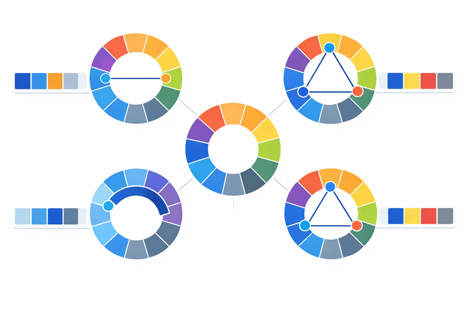
The 360-Degree Foundation
Every harmony rule starts with the HSL (Hue, Saturation, Lightness) color model. Hue is an angle on a circular wheel: red sits at 0°, yellow at 60°, green at 120°, cyan at 180°, blue at 240°, and magenta at 300°. Saturation controls how vivid the color appears (0% is gray, 100% is fully chromatic), and lightness controls how much white or black is mixed in (0% is black, 50% is the pure hue, 100% is white).
The reason HSL matters more than RGB for palette building is simple: RGB channels don't map to human perception. Increasing the red channel from 128 to 255 doesn't "feel" like the same step as doing the same to blue. HSL separates the perceptual axis (hue angle) from intensity axes (saturation, lightness), so rotating the hue by 120° always gives you a visually equidistant color — something RGB sliderscan't guarantee on their own.
Complementary: The 180-Degree Rule
Add 180 degrees to any hue and you land on its direct opposite. That's the entire formula. For blue at 240°, the complement is 240 + 180 = 420, which wraps to 60° — yellow. For red at 0°, the complement is cyan at 180°.
Worked example:start with #2563EB (our site's primary blue). Converting to HSL gives roughly H:217°, S:83%, L:53%. Adding 180° yields 397°, which wraps to 37° — a warm amber. Keeping the same saturation and lightness produces #EB8925 as the complement. The pair generates maximum hue contrast, which is why stop signs (red) use white text and IKEA pairs blue with yellow.
The catch: complementary pairs can vibrate visually at full saturation. When two 100% saturated complements sit directly adjacent in a UI, the boundary between them appears to shimmer — an optical effect called simultaneous contrast. Dropping one color's saturation to 60–70% eliminates the vibration while keeping the contrast benefit.
Analogous Palettes: Staying Within 60 Degrees
Analogous harmonies use hues clustered within a narrow arc — typically ±15° to ±30° from the base. A 5-color analogous palette centered on orange (30°) spans roughly 0° to 60°: from red through orange to yellow. Because the hues share so much common spectral energy, analogous palettes feel naturally cohesive.
You'll see analogous palettes everywhere in nature: autumn leaves range from red (0°) through orange (30°) to gold (45°), all within a 45-degree arc. Sunset skies sweep from deep red (350°) through orange (20°) to peach (30°). Apps like Instagram and Firefox use narrow analogous ranges in their logos to create warm, approachable brand identities.
The risk with analogous is low contrast. If your entire palette sits within 30 degrees at the same saturation and lightness, nothing pops. The fix: vary lightness across at least a 30-point range (e.g., 35% to 65%) so that even closely-spaced hues remain distinguishable in both color-sighted and colorblind contexts.
Triadic: Spacing at 120 Degrees
Three hues evenly spaced at 120-degree intervals form a triadic harmony. Starting at red (0°), the triadic group includes green (120°) and blue (240°) — the three primary colors of the additive RGB model. Starting at orange (30°), you get violet (150°) and teal (270°).
Worked example:base color #16A34A (forest green, H:142°). The triadic mates sit at 142 + 120 = 262° (a deep blue-violet) and 142 + 240 = 382° → 22° (a reddish orange). In hex: #5016A3 and #A34216. These three colors together feel vibrant and balanced because they divide the wheel into three equal 120° arcs, ensuring maximum visual separation without the head-on clash of a complementary pair.
Triadic palettes work best with one dominant color (60% coverage) and the other two as accents (20% each). Google's original logo used a near-triadic scheme: blue, red, yellow, and green — four colors that approximate a tetradic variant of this principle.
Split-Complementary: The Safer Contrast
Instead of jumping straight to the complement at +180°, split-complementary shifts 30° to each side of it. The base hue keeps its position; the two accent colors sit at +150° and +210° from the base. This creates a Y-shaped configuration on the wheel.
Why use it? Red and green are complements, but pairing them reads as "Christmas" in Western culture. Split-complementary takes red (0°) and replaces green (180°) with teal (150°) and blue-green (210°). You get mostof the contrast — the accents are still roughly opposite the base — without the cultural baggage or the visual vibration of a direct complement.
The 60/30/10 rule applies well here: 60% base color, 30% one split-accent, 10% the other. Web landing pages often follow this unconsciously — a blue-dominant page with teal and warm-orange highlights is a split-complementary scheme built from a blue base.
When Monochromatic Beats Multi-Hue
Monochromatic doesn't rotate hue at all. It keeps the angle fixed and varies only saturation and lightness, creating a tint-shade ramp. For #2563EB (H:217°), a monochromatic 5-step palette might range from #0B1D3D (L:15%) through #2563EB (L:53%) up to #B8D4FE (L:85%).
Monochromatic palettes dominate in three contexts: dark mode UIs (where a single hue at varying lightness keeps cognitive load low), professional/corporate brands (law firms, banks, and luxury labels rarely use triadic schemes), and data visualization where hue encodes a differentdimension and you need clean intensity ramps within each hue. Tailwind CSS's entire color system is essentially 22 monochromatic ramps, each with 11 lightness steps from 50 to 950.
Saturation and Lightness: The Variables People Forget
Rotating hue is only half the work. Two colors at the same degree can look completely different: HSL(240, 100%, 50%) is vivid royal blue, while HSL(240, 20%, 80%) is a washed-out periwinkle. Harmony rules give you hue angles, but saturation and lightness control whether the palette actually works in practice.
A practical guideline: for UI design, keep saturation between 50% and 85% for primary colors and drop to 15–30% for background tints. Lightness should span at least a 40-point range across your palette to ensure adequate contrast. The WCAG 2.1 contrast minimumrequires a 4.5:1 ratio for normal text — you can't hit that with two colors at the same lightness, regardless of hue difference.
Another trap: pure complementary colors at S:100% and L:50% can both fail WCAG against white backgrounds. #0000FF (blue) against white passes at 8.6:1, but #FFFF00 (its complement, yellow) scores only 1.07:1 against white — essentially invisible. Always check your palette colors for accessibility contrast before shipping them.
Common Palette Mistakes That Wreck Designs
Using too many saturated hues at once.A tetradic palette gives you four distinct hues at 90° intervals. If all four run at S:100% and L:50%, the design screams. Professional designers typically pick one dominant hue at full saturation and desaturate the rest to S:50–65%. The Material Design system follows this: one primary (blue-500 at full saturation), one secondary (teal-200, desaturated), and neutral grays.
Ignoring colorblindness.About 8% of men have some form of color vision deficiency. Red-green deficiency (deuteranopia) is the most common — a triadic palette of red-green-blue becomes essentially a two-color palette for these users. The fix: ensure your palette distinguishes colors by lightness, not just hue. If you convert your 5-swatch palette to grayscale and each swatch is still distinguishable, it works for colorblind users.
Matching lightness across all swatches.Five colors all at L:50% create a flat, undifferentiated band. Effective palettes intentionally vary lightness: a dark anchor (L:20–30%), a mid-range primary (L:45–55%), and a light accent or background (L:80–90%). This layering creates visual hierarchy even when viewed in grayscale.
Choosing the Right Harmony for Your Project
The table below maps each harmony type to its geometric formula, its visual character, and the design contexts where it performs best. Use it to pick the right starting point before customizing saturation and lightness.
| Harmony | Formula | Visual Character | Design Use Case |
|---|---|---|---|
| Complementary | H + 180° | High tension, maximum contrast | Call-to-action buttons, alerts, sports branding |
| Analogous | H ± 15–30° | Cohesive, calm, natural | Portfolios, nature brands, editorial layouts |
| Triadic | H + 120°, H + 240° | Vibrant, balanced energy | Children's products, creative agencies, game UI |
| Split-Comp. | H + 150°, H + 210° | Contrast with less tension | Landing pages, SaaS dashboards, blog themes |
| Tetradic | H + 90°, +180°, +270° | Rich, complex, needs restraint | Dashboards, infographics, data visualization |
| Monochromatic | Vary S and L only | Elegant, focused, minimal | Dark mode, corporate brands, reading apps |
One final tip: don't marry your first generated palette. Use the gradient generatorto test how your palette colors transition between each other — muddy mid-tones between two harmony colors often reveal that a slight hue shift (5–10°) produces a cleaner gradient. Good palettes aren't just about endpoints; the transitions between them matter just as much.