Linear vs Radial vs Conic: Picking the Right CSS Gradient for the Job
A CSS gradient generator saves you from memorizing the exact syntax of linear-gradient(), radial-gradient(), and conic-gradient()— three functions that look deceptively similar but behave in fundamentally different ways. You're mocking up a hero section and want a diagonal purple-to-indigo wash. Or you need a soft spotlight behind a pricing card. Or maybe a pie-chart-style sweep for a loading indicator. Each of those calls for a different gradient function, with different parameters, and getting one wrong means starting over. This guide breaks down exactly what each function does, how the browser renders it pixel by pixel, and when to reach for one over another.
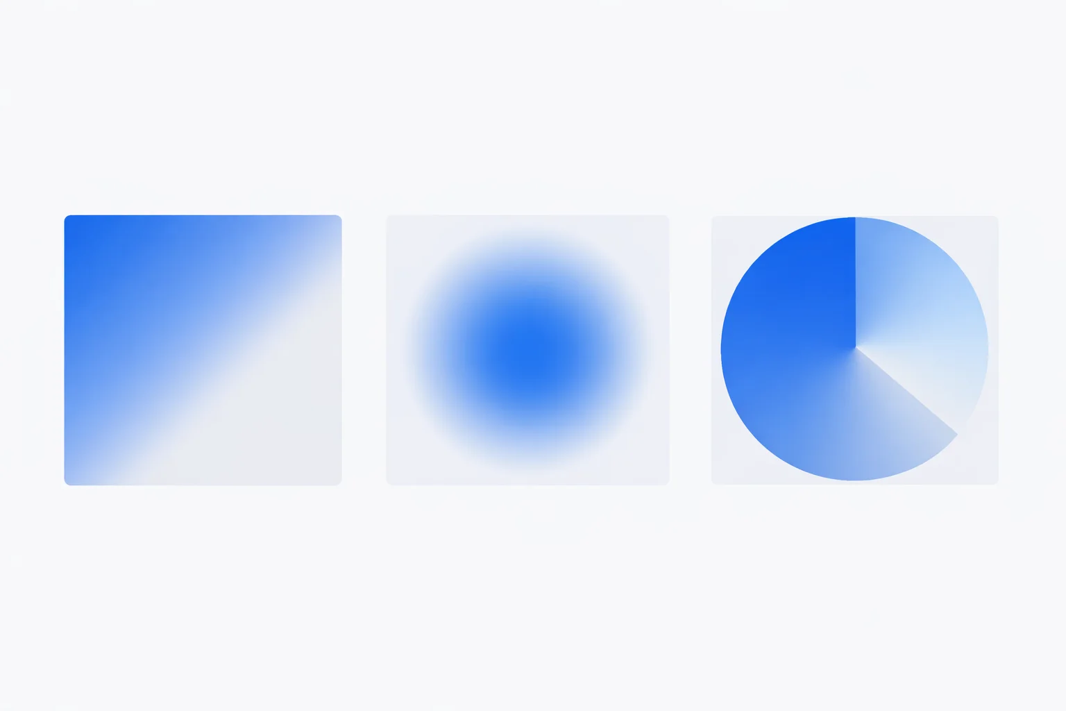
Three Gradient Functions, Three Different Jobs
CSS has exactly three gradient functions. linear-gradient() draws color along a straight line — an angle you pick. radial-gradient() radiates outward from a center point in an ellipse or circle. conic-gradient() sweeps around a center like the hand of a clock. Each produces an <image>value in the CSS spec, which means they work anywhere you'd put a URL — background-image, border-image, even list-style-image.
All three share the concept of color stops: pairs of a color and a position along the gradient line. The browser interpolates in the sRGB color space between adjacent stops, producing smooth transitions at 60+ fps during animations. But the "gradient line" itself is shaped differently for each function — that's the part most developers get wrong on first attempt.
Anatomy of a linear-gradient() Declaration
A linear gradient starts from a line running through the center of the element at the angle you specify. The default angle, 180deg, draws from top to bottom. 90deg goes left to right. 0deg goes bottom to top. A two-stop gradient like linear-gradient(135deg, #667eea 0%, #764ba2 100%) starts purple-blue in the top-left corner and ends deep purple at the bottom-right.
Here's the part that trips people up: the gradient line isn't the width of the element — it's the diagonal at the specified angle. For a 400×200px element at 45deg, the gradient line is approximately 447px long (√(400² + 200²)). The spec calculates the exact length so that the first and last color stops always reach the corners. This means the same angle on different aspect ratios produces slightly different visual results. The keyword to bottom right avoids this by always pointing at the exact corner regardless of element dimensions.
Need a hard stripe instead of a smooth blend? Set two adjacent stops to the same position: linear-gradient(90deg, red 50%, blue 50%) splits the element cleanly in half with no transition zone. This technique powers progress bars, flag patterns, and striped backgrounds without a single image file.
Radial Gradients: Circles, Ellipses, and Sizing Keywords
A radial gradient starts at a center point and expands outward. The default shape is an ellipse that matches the element's aspect ratio — on a 400×200px box, the ellipse is twice as wide as it is tall. Switch to circle for a perfectly round gradient regardless of the element shape.
Four sizing keywords control how far the gradient extends: closest-side, farthest-side, closest-corner, and farthest-corner (the default). On a 400×200px element centered at 50% 50%, farthest-corner draws the final stop at the corner — roughly 224px from center. closest-side stops at just 100px (the nearest edge). That's a 2.24× difference in gradient size from the same color stops.
Position the center with at: radial-gradient(circle at 20% 80%, #f12711, #f5af19) places the glow near the bottom-left. Designers use off-center radial gradients for spotlight effects behind UI elements — a subtle technique that adds depth without shadows.
The 360° Sweep: How conic-gradient Differs
Where linear gradients run along a line and radial gradients expand from a point, conic gradients rotate around one. Think of it as a color pie: the browser draws color around a 360° arc starting from the top (12 o'clock position) by default. conic-gradient(red, yellow, lime, aqua, blue, magenta, red) produces a full color wheel — the same one you'd see inside a hex to RGB converter's hue picker.
The from keyword rotates the starting angle: conic-gradient(from 90deg, ...)begins at the 3 o'clock position instead of 12. Combined with at for positioning, you can build pie charts entirely in CSS — no SVG or canvas needed. A two-slice chart showing 73% progress: conic-gradient(#2563EB 0% 73%, #E5E7EB 73% 100%). That single line replaces a dozen lines of SVG markup.
Conic gradients arrived in browsers later than linear and radial — Chrome 69 (2018), Firefox 83 (2020), Safari 12.1 (2019). For projects still supporting pre-2018 browsers, add a solid background-color fallback before the gradient declaration.
Color Stop Positions and Hard Lines
Every color stop has an optional position value — a percentage, a length (px, em, rem), or nothing at all. When you omit positions, the browser distributes stops evenly. Three stops without positions land at 0%, 50%, and 100%. Five stops: 0%, 25%, 50%, 75%, 100%.
Explicit positions give you fine-grained control. A gradient like linear-gradient(90deg, #0f0c29 0%, #302b63 30%, #24243e 100%) compresses the first transition into the left 30% of the element while the second transition spans the remaining 70%. This asymmetry creates more visual interest than evenly spaced stops — a trick professional designers rely on.
Two stops at the same position create a hard line with zero blending: linear-gradient(90deg, red 40%, blue 40%). This is the CSS gradient equivalent of a border — except it works at any angle. Stack multiple hard-line pairs for stripes: repeating-linear-gradient(45deg, transparent, transparent 10px, #ccc 10px, #ccc 20px) produces a 45° candy-stripe pattern repeating every 20px. The browser tiles this infinitely across the element at virtually zero performance cost.
Which Gradient Type Fits Your Design?
| Use Case | Best Type | Why |
|---|---|---|
| Hero section background | Linear (135°) | Diagonal wash looks dynamic without competing with text |
| Button hover glow | Radial (circle) | Centered spotlight follows the user's focus |
| Progress indicator | Conic | Sweep angle maps directly to percentage (73% = 262.8°) |
| Card depth/vignette | Radial (ellipse) | Ellipse adapts to container aspect ratio automatically |
| Diagonal stripe pattern | Repeating linear | Hard stops + repeating-linear-gradient tile infinitely |
| Color picker hue ring | Conic | 360° hue sweep matches the HSL color model natively |
The rule of thumb: if the color transition has a direction, use linear. If it has a focal point, use radial. If it has an arc, use conic. When you're unsure, start with a linear at 135° — it works well with left-aligned content because the darker tone frames the text while the lighter side provides breathing room.
Rendering Cost, Banding, and Fallbacks
CSS gradients are rendered by the browser's compositor on the GPU. A static gradient costs almost nothing — comparable to rendering a solid color. The browser calculates each pixel's color mathematically rather than decoding an image file, so there's no network request and no memory overhead from bitmap storage. For a 1920×1080 hero with a two-stop linear gradient, the computation is roughly 2 million multiply-adds — finished in under 1ms on any GPU from the last decade.
Banding — visible steps between colors instead of a smooth transition — appears when the color difference between stops is large and the element covers many pixels. An 8-bit display shows 256 levels per channel. A gradient from #000000 to #FFFFFFacross 1920px means each shade covers about 7.5 pixels. That's usually fine. But a gradient from #0a0a0a to #1a1a1a across the same width spreads only 16 levels over 1920px — 120px per shade, clearly visible as bands. The fix: widen the color range, add an intermediate stop, or apply a subtle noise texture overlay.
Always declare a background-color before your gradient. If the gradient syntax fails (old browser, typo), the solid color acts as a fallback. This costs zero bytes when the gradient renders normally.
Layering Multiple Gradients on One Element
CSS background-image accepts a comma-separated list of values, drawn back to front. The first gradient is on top. This lets you combine effects: background-image: linear-gradient(to bottom, rgba(0,0,0,0.3), transparent), radial-gradient(circle at 30% 70%, #667eea, #764ba2) puts a dark-to-transparent veil over a purple radial glow — a depth technique often seen on SaaS landing pages.
You can stack up to the browser's practical limit (no spec cap, but 5-10 layers is common). Each layer can have its own background-size and background-position, enabling complex patterns from pure CSS. A checkerboard, for instance, requires just two 45° linear gradients at offset positions — no image file, no SVG.
For design systems, define gradient tokens as CSS custom properties: --gradient-primary: linear-gradient(135deg, var(--blue-500), var(--purple-600)). Every component that references the token stays consistent, and changing the brand gradient is a one-line edit. If you're building with Tailwind, check our RGB to hex converter to translate design tool colors into the hex values Tailwind's arbitrary value syntax expects.