What a Color Blindness Simulator Actually Shows You
A color blindness simulator rebuilds what your design looks like to the roughly 300 million people whose eyes process color differently — and the result is often nothing like you expect. Take a soft alert red and a soft success green of the same brightness. To you they're screaming opposites. Run them through deuteranopia and they land about 5 ΔE apart — two near-identical olive smudges a colorblind user can't separate. That gap between what you see and what they see is exactly what this tool measures, color by color, and puts a number on.
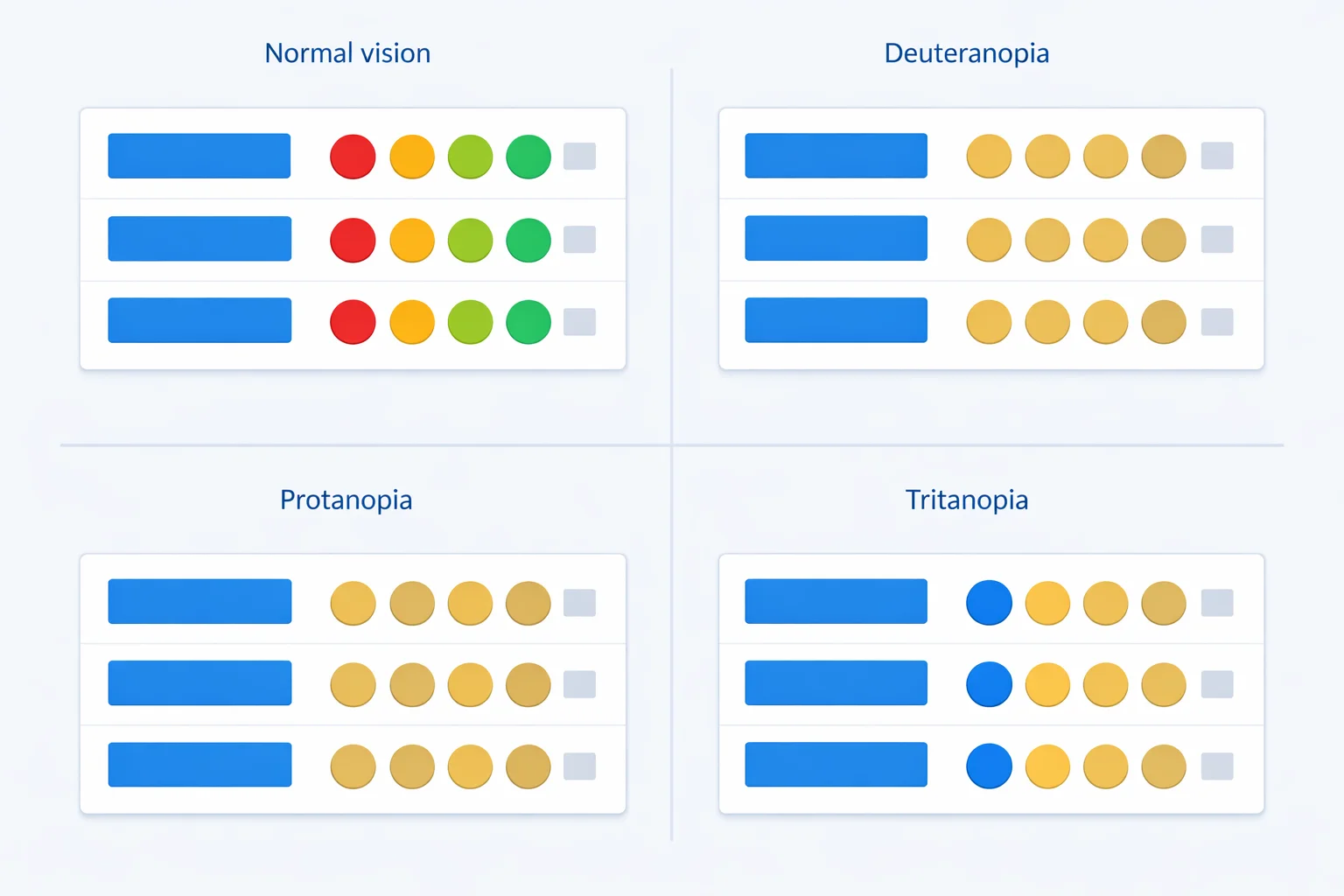
What This Simulator Models
Each simulated swatch comes from multiplying your color's red, green, and blue channels by a 3×3 transformation matrix — one matrix per deficiency type. These are the standard matrices used across accessibility tooling — the Machado model, the same one built into Chrome's DevTools — derived from research into how missing or shifted cone cells remap the visible spectrum. Feed in #E11D48 (a rose red) and the deuteranopia transform returns #8E8242, a dull olive-gold. The hue is gone; only the lightness survives.
The tool covers seven profiles: the three complete dichromacies (protanopia, deuteranopia, tritanopia), their milder anomalous forms (protanomaly, deuteranomaly, tritanomaly), and full achromatopsia. Each swatch is labeled with its prevalence so you can weight your decisions — a problem that only shows up under tritanopia affects far fewer people than one that shows up under deuteranomaly. If you want the raw channel values behind any color, our hex to RGB converter breaks them out.
The Grayscale Myth, and What Color Blindness Really Is
Ask most people what color blindness looks like and they'll say "black and white." That's almost never true. Seeing the world in pure grayscale — achromatopsia — is staggeringly rare, around 1 in 30,000 people. The other 99.99% of colorblind people see plenty of color. They just can't separate certain pairs.
Normal color vision uses three cone types tuned to long (red), medium (green), and short (blue) wavelengths. Color blindness happens when one cone type is missing or its sensitivity shifts. Lose the long-wavelength cone and reds dim and slide toward green — that's protanopia. The National Eye Institute groups these into red-green, blue-yellow, and complete types. The grayscale tile in this tool is the rare achromatopsia case; treat the protan and deutan tiles as the realistic everyday experience for most affected users.
Protan, Deutan, Tritan: The Three Confusion Axes
Every deficiency collapses one axis of color. Knowing which axis tells you which palettes are safe.
| Type | Missing/weak cone | Confuses | Prevalence (men) |
|---|---|---|---|
| Protanopia / -anomaly | Long (red) | Red ↔ green, red looks dark | ~1% / ~1% |
| Deuteranopia / -anomaly | Medium (green) | Red ↔ green, normal brightness | ~1% / ~6% |
| Tritanopia / -anomaly | Short (blue) | Blue ↔ green, yellow ↔ pink | <0.01% |
Notice the prevalence column. Deuteranomaly alone affects about 6% of men — more than all other types combined. If you only have time to test against one profile, test deuteranomaly. Tritanopia is real but rare, which is why blue-yellow palettes are usually the safest choice.
How the ΔE Confusability Score Works
The pair checker doesn't just show you simulated swatches — it puts a number on how far apart they are. It converts both simulated colors into CIE L*a*b* space and measures the straight-line distance between them, a value called ΔE (delta E). ΔE is built so that equal numbers feel like equal perceptual jumps, unlike raw RGB distance.
Here's the scale this tool uses. A ΔE of 2.3 is the smallest difference an average person notices at all. Below 5, two colors are effectively identical. Between 5 and 11, they're confusable — technically different, but a quick glance can't separate them. Above 25, they're comfortably distinct. So when you enter a red and a green that sit 114 ΔE apart in normal vision but drop to 5 ΔE under deuteranopia, the tool flags that row "Identical" — because for a deutan viewer, they basically are the same color.
The Red-Green Trap in Status Colors
The single most common accessibility failure is the red/green status pattern: red for error, green for success. But here's the part most guides get wrong — red and green don't automatically merge. What kills them is matching lightness. A soft red and a soft green tuned to the same brightness (say #FF6B6B and #51CF66) sit 114 ΔE apart in normal vision, then crash to 5 ΔE under deuteranopia. Strip away the hue difference and there's nothing left to tell them apart.
Give those same two colors a lightness gap and they survive. A darker error red against a medium success green — the typical #E74C3C / #2ECC71dashboard pairing — still measures about 22 ΔE under deuteranopia: borderline, but distinguishable because brightness carries the signal that hue can't. That's the real lesson of the simulator: red-green pairs aren't doomed, equiluminant ones are. This is why GitHub added a +/− indicator alongside its diff colors, and why solid forms pair a red border with an icon and the word "Error." Load the "Equal-bright red / green" preset in the pair checker, watch the deuteranopia row read "Identical," then switch to "Status red / green" and see it climb back to borderline. Compare that against the legibility side of the problem with our WCAG contrast checker, which handles whether text is readable rather than whether two colors are distinguishable.
Color Pairs That Survive Every Deficiency
Not all color pairs break. The trick is choosing colors separated on an axis that no common deficiency collapses — and that almost always means combining a hue difference with a strong lightness difference. Blue and orange is the workhorse pairing: it stays well above 25 ΔE under deuteranopia, protanopia, and tritanopia because blue-vs-orange lives on the blue-yellow axis that red-green viewers keep intact.
| Pair | Normal ΔE | Deuteranopia ΔE | Verdict |
|---|---|---|---|
| #2563EB blue / #F97316 orange | ~143 | ~148 | Safe |
| #FF6B6B red / #51CF66 green (equal bright) | ~114 | ~5 | Fails |
| #EC4899 pink / #9CA3AF gray | ~70 | ~8 | Fails |
| #E74C3C red / #2ECC71 green (status) | ~120 | ~22 | Risky |
The numbers above are why blue-orange dominates accessible data visualization. When you do need many distinct colors — say, a chart with eight series — pair color separation with a second cue and lean on a tested scheme from our color palette generator rather than picking hues by eye.
Why Color Alone Is Never Enough
The deepest lesson a simulator teaches is that color should never be the only way you encode information. The Web Content Accessibility Guidelines make this formal: WCAG Success Criterion 1.4.1 (Use of Color) requires that any information conveyed by color also be available some other way. In practice that means a few cheap, high-impact habits:
- Add a shape or icon. A red ✕ and a green ✓ survive every deficiency because the symbol carries the meaning, not just the hue.
- Label chart lines directly. Put the series name at the end of each line instead of relying on a color-only legend.
- Vary lightness, not just hue.Two colors that differ in lightness stay distinguishable even when their hue collapses — that's why dark-blue-vs-light-orange beats medium-red-vs-medium-green.
- Use position and pattern. Traffic lights work for colorblind drivers because red is always on top — position backs up the color.
Where Screen Simulation Falls Short
Be honest about what a simulator can and can't do. The matrices model the three dichromacies cleanly, but real anomalous trichromacy exists on a spectrum — one person's deuteranomaly is mild, another's is nearly deuteranopia, and a single matrix can't capture that whole range. The simulation also assumes your monitor is reasonably calibrated; an uncalibrated screen already shifts colors before any deficiency math runs.
And no simulator replaces a real colorblind tester. These tools are a fast first pass that catches the obvious red-green collisions before they ship — use them to triage, then confirm critical interfaces with people who actually have the condition. Treat the ΔE verdicts as a warning system, not a certificate. When a pairing fails, reach for HSL to fix it: nudging lightness apart in our hex to HSL converter usually rescues a confusable pair faster than guessing new hex codes.