WCAG Contrast Requirements: What AA and AAA Ratios Mean for Your Design
A color contrast checker isn't optional anymore — it's a legal requirement. In 2019, Domino's Pizza lost a Supreme Court appeal after a blind user couldn't order food through their website, and the court ruled that the ADA applies to digital properties. Since then, web accessibility lawsuits in the US have surged past 4,600 per year, with contrast failures cited in the majority of complaints. The fix starts with one number: the WCAG contrast ratio between your text color and its background.
The Lawsuit That Changed Web Color Choices
Before Robles v. Domino's Pizzareached the Supreme Court, most teams treated color accessibility as a nice-to-have. The ruling didn't create new law — it confirmed that Title III of the ADA covers websites. In the EU, the European Accessibility Act (EAA) takes full effect in June 2025, requiring WCAG 2.1 AA compliance for all commercial digital services. Australia's DDA, Canada's ACA, and the UK's Equality Act carry similar requirements. The common thread across every jurisdiction: WCAG 2.1 Level AA is the de facto benchmark, and its contrast ratios are the most frequently tested success criteria.
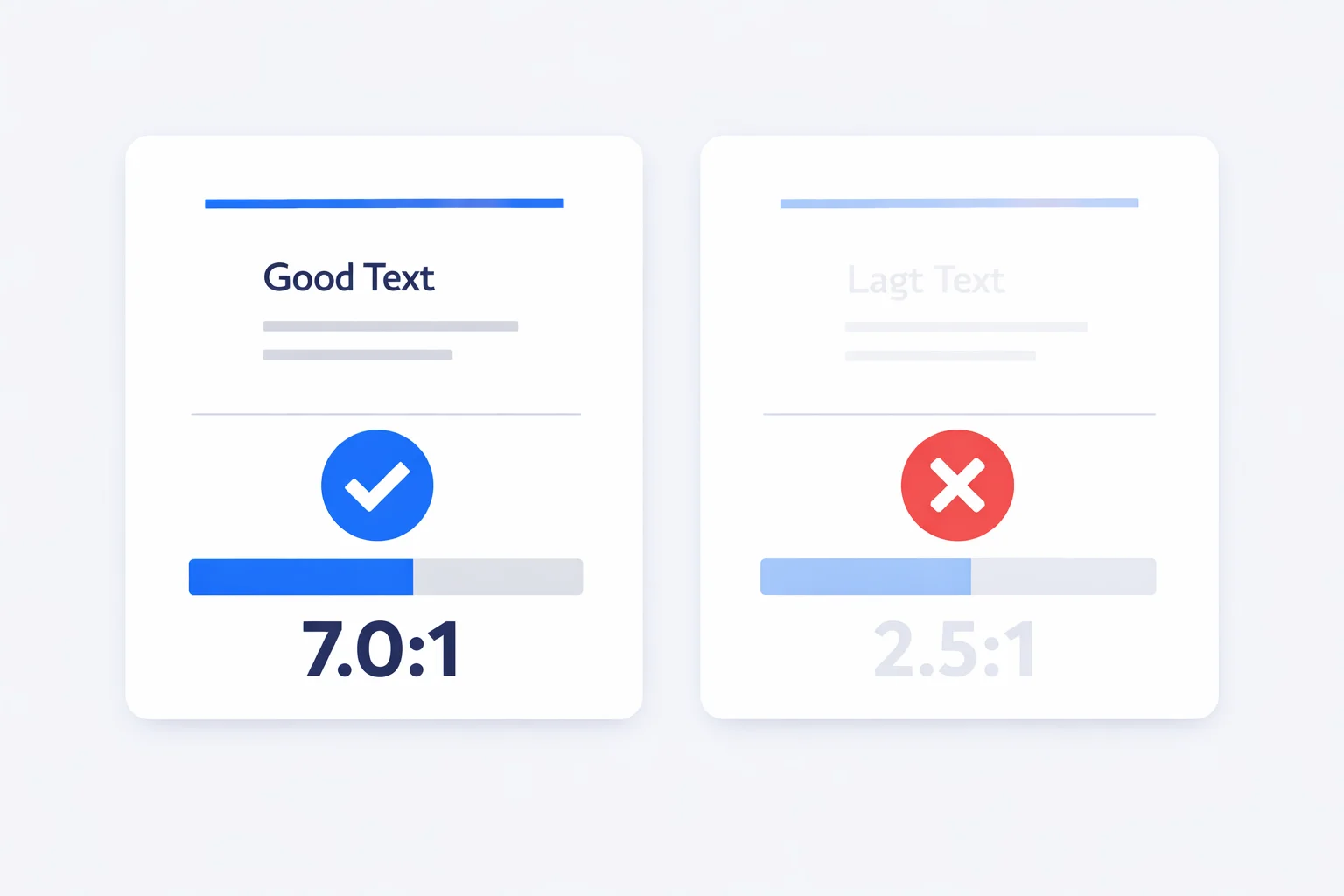
The numbers are specific. Normal body text must hit a contrast ratio of 4.5:1. Large text (18px regular or 14px bold and above) needs 3:1. UI components — form borders, icons that convey meaning, focus indicators — require 3:1 under Success Criterion 1.4.11, added in WCAG 2.1. Fail any of these and your site has a measurable, documented violation that a plaintiff's attorney can cite in a demand letter.
How the WCAG Formula Actually Works
The contrast ratio formula looks simple: (L1 + 0.05) / (L2 + 0.05), where L1 is the relative luminance of the lighter color and L2 is the darker. The tricky part is computing relative luminance correctly. You can't just average the RGB channels — that ignores how human eyes perceive brightness.
Each sRGB channel (R, G, B) gets divided by 255, then run through a gamma expansion. Values at or below 0.04045 divide by 12.92. Everything above uses ((value + 0.055) / 1.055) ^ 2.4. The three linearized channels then combine with perceptual weights: 0.2126 × R + 0.7152 × G + 0.0722 × B. Green dominates because human vision has peak sensitivity around 555nm — green light. Red contributes about three times more than blue.
The 0.05 offset in the ratio formula isn't arbitrary. It models ambient light reflecting off the screen — even a fully black pixel (#000000) isn't truly zero luminance in a real viewing environment. The maximum possible contrast ratio under WCAG is 21:1, which occurs between pure black (L = 0) and pure white (L = 1): (1 + 0.05) / (0 + 0.05) = 21.
Worked Example: #767676 on White
Why does #767676 appear in every accessibility discussion? Let's calculate it. The hex value 76 converts to decimal 118. Divide by 255 to get 0.4627. Since 0.4627 > 0.04045, apply gamma: ((0.4627 + 0.055) / 1.055) ^ 2.4 = 0.1845. All three channels are identical (it's a pure gray), so relative luminance = 0.2126 × 0.1845 + 0.7152 × 0.1845 + 0.0722 × 0.1845 = 0.1845.
White has luminance 1.0. Plug into the ratio: (1.0 + 0.05) / (0.1845 + 0.05) = 1.05 / 0.2345 = 4.48:1. Wait — that's #777777. For #767676, the decimal is 118, and if you work through the precise sRGB linearization, you get luminance 0.1810, yielding (1.05) / (0.2310) =4.54:1. That 0.06-point difference is the gap between a legal failure and a pass. One hex digit.
This is why designers memorize #767676 as the boundary gray. Anything lighter on white fails AA. Need to verify a different pair? Paste both colors into our hex to RGB converter to extract the decimal channels, then check the ratio above.
AA vs. AAA — Which Level to Target?
Most accessibility laws worldwide reference Level AA, not AAA. But that doesn't mean AAA is irrelevant. Here's the practical breakdown:
| Criteria | AA | AAA |
|---|---|---|
| Normal text ratio | 4.5:1 | 7:1 |
| Large text ratio | 3:1 | 4.5:1 |
| Legal baseline in US, EU, AU | Yes | No |
| Achievable with most brand palettes | Usually | Often not |
| Recommended for critical content | Minimum | Ideal |
Target AA site-wide and AAA for anything users must read to complete a task: error messages, form labels, navigation links, and pricing information. Google's Material Design 3 system uses a similar approach — their “on-surface” text colors hit 7:1+ while decorative elements stop at 3:1.
The Large Text Exception That Trips Up Designers
WCAG defines “large text” as 18pt (24px) for regular weight, or 14pt (approximately 18.66px) for bold. At these sizes, the AA threshold drops from 4.5:1 to 3:1 because bigger letterforms are inherently more legible. But here's where teams get burned: CSS pixels aren't always the same as rendered pixels.
On a 2x Retina display, a 16px CSS font renders at 32 physical pixels. That doesn't make it “large text” under WCAG — the spec measures CSS pixel size, not device pixels. Font weight matters too. A 16px heading at font-weight 700 still isn't large text because 16px is below the 18.66px bold threshold. Only 14pt bold (roughly 19px in CSS) and above qualifies. Get this wrong and you'll design entire navigation bars with 3:1 contrast assuming they qualify as “large text” — then fail an audit.
When NOT to Rely on Contrast Alone
Contrast ratios measure luminance difference, but accessibility is broader than brightness. Two colors can pass 4.5:1 yet remain indistinguishable to someone with deuteranopia (green-red color blindness), which affects roughly 6% of males. Red text on a green background might compute to 5.1:1 contrast — technically AA-compliant — but roughly 300 million people worldwide couldn't tell them apart.
WCAG Success Criterion 1.4.1 says color must not be the only visual means of conveying information. If you're marking required form fields with red asterisks, add the word “required” too. Error states need icons or text labels alongside color changes. Charts should use patterns or labels, not just color coding. Pair this contrast checker with a color picker that lets you test multiple output formats and visually compare alternatives.
Fixing Failing Colors Without Destroying Your Brand
When brand colors fail contrast checks, the instinct is to make text darker. That works, but it's not the only lever. Adjusting the background is often less disruptive. A brand blue at #3B82F6 on white gives only 3.13:1 — an AA failure. Instead of darkening the blue to #1D4ED8 (which changes the brand feel), try tinting the background to #EFF6FF. Now the same #3B82F6 sits on a surface that shifts the luminance math enough to clear 3:1 for large headings, and you've kept your signature blue intact.
For body text, the hue-preserving trick works well: convert the failing color to HSL, keep hue and saturation identical, and reduce lightness until you hit 4.5:1. Our tool does this automatically in the “Suggested Fix” panel. The result is perceptually the same color family — just dark enough to pass. Generate a full set of accessible shades with the color palette generator once you've nailed the primary pair.
One more technique that's underused: semi-transparent overlays. If your hero section uses white text over a photograph, a background: linear-gradient(rgba(0,0,0,0.55), rgba(0,0,0,0.55)) behind the text guarantees minimum contrast regardless of the image content. The overlay darkens the photo just enough — and at 55% opacity, white text on any image will exceed 4.5:1 against the darkened pixels.
According to the W3C's Understanding SC 1.4.3 documentation, incidental text (logos, inactive controls, and purely decorative text) is exempt from contrast requirements. Disabled form buttons, watermarks, and brand logotypes don't need to meet 4.5:1 — but any text a user needs to read to operate your interface does.