RGB to Pantone Matching: Why Exact Conversion Doesn't Exist
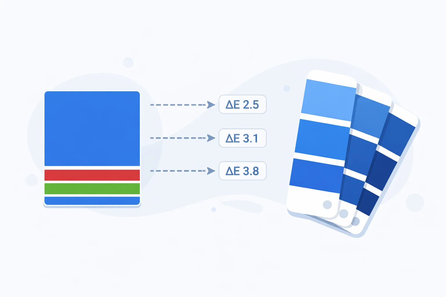
An RGB to Pantone converterdoesn't actually convert — it approximates. RGB is a continuous space of 16.7 million colors generated by mixing red, green, and blue light. Pantone is a fixed catalog of 2,161 spot ink formulas. There's no equation that bridges the two perfectly. What this tool does — and what every commercial tool does under the hood — is search the Pantone library for the swatch whose Lab coordinates land closest to your input RGB value, measured by a metric called delta-E. The difference matters: designers who expect a pixel-perfect translation get burned when the printed swatch arrives 3 or 4 shades off.
No Formula, Only Proximity
Most color conversions — RGB to hex, RGB to CMYK — have deterministic formulas. Plug in numbers, get a result. RGB to Pantone is fundamentally different. Pantone colors are mixed from 18 proprietary base inks in specific ratios (Pantone publishes the recipes in its Formula Guide). Each color is assigned a number, not derived from a coordinate system. So matching RGB to Pantone is a search problem, not a math problem.
The search works like this: convert your input RGB to the CIE Lab color space (a perceptually uniform model designed in 1976), then compute the Euclidean distance — delta-E — between your Lab triplet and the Lab triplet of every Pantone swatch. The smallest distance wins. It's brute force, but with only 2,161 entries it runs in microseconds.
Delta-E: The Ruler for Color Distance
Delta-E (ΔE) quantifies how different two colors look to a human observer. The CIE76 formula calculates it as the straight-line distance in Lab space: ΔE = √((L₁−L₂)² + (a₁−a₂)² + (b₁−b₂)²). Here's what the numbers mean in practice:
| ΔE Range | Perception | Print Implication |
|---|---|---|
| 0 – 1.0 | Imperceptible to the human eye | Perfect match — sign off without hesitation |
| 1.0 – 2.0 | Only a trained colorist sees the difference | Excellent for commercial print work |
| 2.0 – 5.0 | Noticeable if swatches are side by side | Acceptable for most non-brand-critical jobs |
| 5.0 – 10.0 | Obvious shift — anyone can see it | Request a physical proof before printing |
| > 10.0 | Clearly different colors | Rethink the color — Pantone can't replicate it |
A more advanced formula, CIEDE2000, adds corrections for hue, chroma, and lightness weighting. For most design decisions, CIE76 and CIEDE2000 agree on the top 2-3 matches — the difference only matters when two swatches are within ΔE 0.5 of each other. Pantone's own Color Bridge Guide uses CIEDE2000 internally, but CIE76 remains the industry standard for quick web-based matching.
Worked Example: Matching RGB(0, 82, 160)
Let's trace through a real match step by step. Our input is RGB(0, 82, 160) — a mid-range corporate blue.
Step 1 — Linearize sRGB:R' = 0/255 = 0.0, G' = 82/255 = 0.3216, B' = 160/255 = 0.6275. Apply the gamma transform: each value below 0.04045 divides by 12.92; above it, the formula is ((v + 0.055) / 1.055)^2.4. Result: R_lin = 0.0, G_lin = 0.0838, B_lin = 0.3502.
Step 2 — Convert to XYZ (D65): Using the sRGB matrix multiplication: X = 0.0999, Y = 0.0852, Z = 0.3164. Normalize against D65 white point (0.95047, 1.0, 1.08883): X_n = 0.1051, Y_n = 0.0852, Z_n = 0.2906.
Step 3 — XYZ to Lab: Apply the f() function (cube root above threshold, linear below). L = 35.1, a = 6.8, b = −42.3. This Lab triplet describes the color in perceptual terms.
Step 4 — Search Pantone:Calculate ΔE against all 2,161 swatches. The top 3: PMS 286 C (ΔE ≈ 3.2), PMS 7462 C (ΔE ≈ 5.0), PMS 301 C (ΔE ≈ 5.5). PMS 286 C wins — it's the classic blue used by Samsung, NHS, and many universities.
Why the Same PMS Number Looks Different on Two Stocks
A printed color isn't just ink — it's ink interacting with paper. PMS 286 C (Coated) appears as a crisp, saturated blue because the glossy paper surface keeps ink sitting on top, reflecting light cleanly. PMS 286 U (Uncoated) uses the same ink formula, but the porous paper fibers absorb the ink, scattering light and producing a softer, more muted blue. The visual difference between C and U versions of the same Pantone number can exceed ΔE 8, which is larger than the gap between two entirely different PMS numbers on the same stock.
This is why online converters that don't specify C or U are dangerously misleading. When you send a print spec to a press operator, always include the full designation: "PMS 286 C" for coated, "PMS 286 U" for uncoated. Omitting the suffix leaves the printer guessing — and guessing costs reprints.
When NOT to Trust an Online Pantone Match
Online converters (including this one) have inherent limitations. Be skeptical in these situations:
- Your delta-E exceeds 5.0 — the "closest" match may not look close at all in print. Order a physical fan deck swatch and compare under D50 (5,000K) lighting. Fluorescent office lights shift blue perception significantly.
- Brand-critical colors — Coca-Cola Red isn't just "the nearest PMS to RGB 244, 0, 0." It's PMS 484 C, specifically chosen and licensed. Major brands define their Pantone first, then derive RGB/hex from it — not the other way around.
- Neon or high-saturation RGB values — colors like RGB(0, 255, 0) or RGB(0, 255, 255) exist on screen but have no close Pantone equivalent. The best match might be ΔE 15+. For vivid fluorescents, Pantone sells a separate Neon Guide with 7 fluorescent base inks.
- Metallic or specialty finishes — Pantone's Metallic Coated guide (300+ metallics) can't be simulated on screen at all. If you need gold or silver, reference the Pantone Metallics Guide directly — no converter will help.
RGB Colors That Pantone Simply Cannot Reproduce
Your monitor generates color by emitting light through RGB subpixels — a process that can produce intensely saturated hues. Pantone inks reflect light off paper, which physically limits their gamut. The biggest gaps:
| RGB Color | Closest Pantone | Approx. ΔE | Issue |
|---|---|---|---|
| 0, 255, 0 | PMS 354 C | ~18 | Pure green is unreachable — inks absorb too much |
| 0, 255, 255 | PMS 311 C | ~14 | Vivid cyan fades to teal on paper |
| 255, 0, 255 | PMS Rhodamine Red C | ~11 | Electric magenta loses glow in reflective media |
| 0, 0, 255 | PMS Blue 072 C | ~9 | Deep blue darkens significantly on paper |
| 255, 255, 0 | PMS Yellow C | ~4 | Best case — yellows match relatively well |
The pattern is clear: pure RGB primaries and secondaries (except yellow) sit outside the Pantone gamut. If your brand color is a saturated green or cyan, you'll need to compromise in print — either accept a muted version or explore Pantone's Extended Gamut (XG) system, which adds orange, green, and violet inks to the standard CMYK process.
Pantone vs. CMYK Process — Which to Specify
CMYK process printing mixes four inks (cyan, magenta, yellow, black) using halftone dots. It's cheap for multi-color jobs like photographs. Pantone spot color uses a single pre-mixed ink — one pass, one solid layer, no dots. The choice affects cost, accuracy, and consistency:
- Pick Pantone when your run is under 5,000 units, the color is brand-critical, or you need metallic/fluorescent/pastel shades that CMYK can't reach. Each spot color adds a press plate (~$50–$200 per color per run).
- Pick CMYK when you're printing full-color photos, have more than 4 colors in the design, or want to minimize plate costs. CMYK can simulate most Pantone colors within ΔE 3-6 using RGB-to-CMYK conversion, but blues and oranges often shift visibly.
- Use both when the job has photographs (CMYK) plus a brand logo that must hit an exact color (Pantone spot). This "5-color" or "6-color" setup is standard for magazines and premium packaging.
Reference: Brand Reds and Their Nearest PMS
Red is the most commonly specified brand color and one of the trickiest to match. Here's how popular brand reds map to the Pantone system — note how small RGB shifts produce different PMS matches:
| Brand | RGB | Official Pantone | ΔE (computed) |
|---|---|---|---|
| Coca-Cola | 244, 0, 0 | PMS 484 C | ~5.8 |
| YouTube | 255, 0, 0 | PMS 1788 C | ~5.2 |
| Target | 204, 0, 0 | PMS 186 C | ~3.9 |
| Netflix | 229, 9, 20 | PMS 1795 C | ~4.1 |
| Canon | 188, 0, 45 | PMS 199 C | ~3.5 |
Notice: none of these delta-E values are under 2.0. That's because each brand chose their Pantone through physical swatch testing, not by running a converter. The RGB value in their style guide is a derived approximationfor screens — the Pantone came first. If you're building a brand from scratch, start by picking a Pantone swatch you like under D50 light, then derive your hex and RGB from Pantone's published bridge data. Going the other direction — screen to ink — always introduces compromise.